
Yan Farm Health
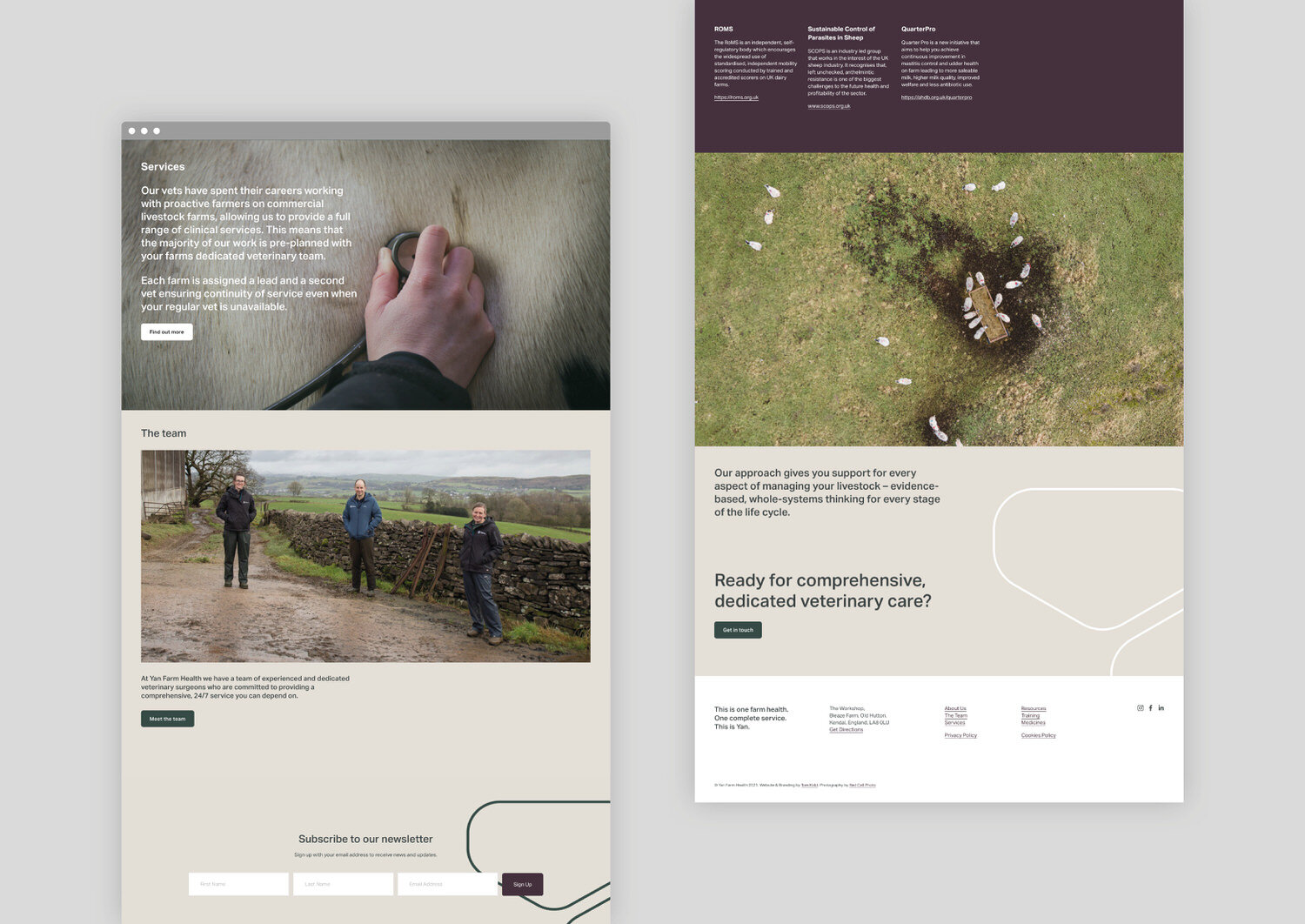
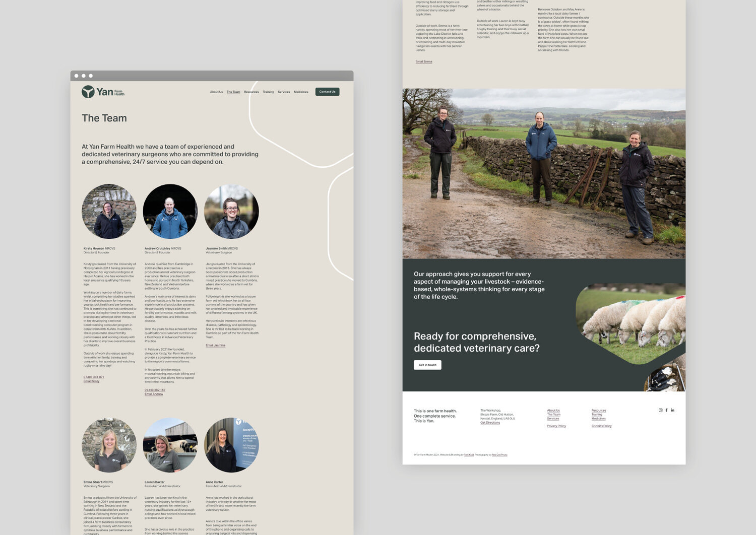
Based in the rural farming country that straddles the Cumbria and Lancashire border, Yan is a start-up veterinary service founded by experienced practitioners, Kirsty Howson and Andrew Crutchley. YAN means ‘one’ in the ancient Cumbrian dialect, so when I was approached about creating their new brand and website, it was my intention to connect the heritage of the farming community that they serve to the modern reality of agile veterinary work.
Deliverables
– Logo design
– Art Direction
– Brand identity
– Vehicle Graphics
– Brand guidelines
– Website design
– Social media graphics
– Signage
– Advertising


The YAN brand marque evolved through looking at the variety of services offered by the business and developing a Venn diagram to reveal the letter Y. Predominantly working in the large animal sector, the marque also makes reference to the faces of animals that Kirsty and Andrew care for in their practice.


The palette and tones seen across the brand evoke the south-Lakeland fells and a clean look reflects the forward-looking nature of the business.


The photography for this project was completed by my good friend Mark at Red Cell Photography. Mark visited the location along with his drone in the Lake District and got some great photos of both the team and the environment in which they excell.